Joybound Travel
A joyful travel identity designed to inspire families to explore, connect, and experience the world together.

Time Frame:
5 Weeks
Category:
Brand Design - Tourism
My Role:
Brand Designer
Making every journey part of the adventure.
Joybound Travel is a family-focused travel agency built around the idea that some of the best memories are made along the way. The brand encourages families to experience the world with curiosity, wonder, and joy while making travel feel exciting, welcoming, and approachable.
I developed the brand from concept to application, creating a cohesive identity system that combines expressive graphics, vibrant color, and approachable typography. The final identity extends across digital experiences, marketing materials, and branded touchpoints designed to capture the excitement of discovering the world together.

Finding the Joy in the Journey
Exploring movement, connection, and adventure through form.
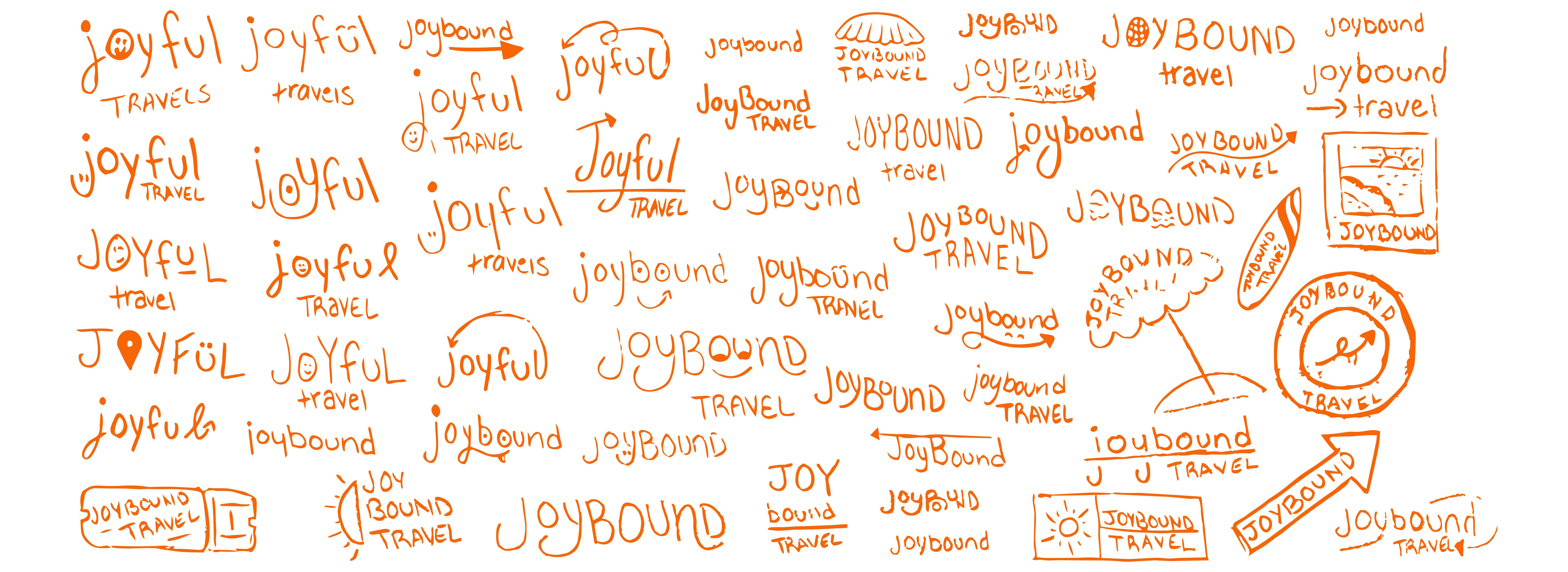
The identity began with exploring how the ideas of travel, movement, and joy could come together in a single recognizable mark. Early sketches experimented with arrows, paths, circular forms, and playful typography to communicate the feeling of going somewhere new.
The final direction uses a continuous curved arrow that travels through the wordmark, creating a sense of movement while visually connecting the beginning and end of the journey. This became the defining element of the identity and a flexible graphic device throughout the brand.
Designed for the Journey
A flexible logo system built to travel across every touchpoint.
The identity system includes primary, secondary, and tertiary marks designed to adapt across different formats while maintaining a recognizable visual language. The primary mark combines the full Joybound Travel name with the signature curved arrow, while the secondary mark simplifies the identity for more compact applications.
The tertiary mark reduces the identity even further, combining the initial with the arrow to create a small, recognizable brand element for icons, stamps, and other limited-space applications.

Inspired by Exploration
A bright, welcoming system inspired by the colors of travel.
Joybound’s palette draws inspiration from sunshine, open skies, warm sand, and natural landscapes. Bright yellow, blue, and orange bring energy and optimism to the identity, while neutral sand and brown tones provide warmth and balance.
Filson Pro gives headlines a friendly sense of personality and movement, while Museo Sans keeps supporting information clean and easy to read. Together, the color and typography create an identity that feels adventurous and playful while remaining approachable for families.

Planning Made Joyful
Bringing the brand into a welcoming digital experience.
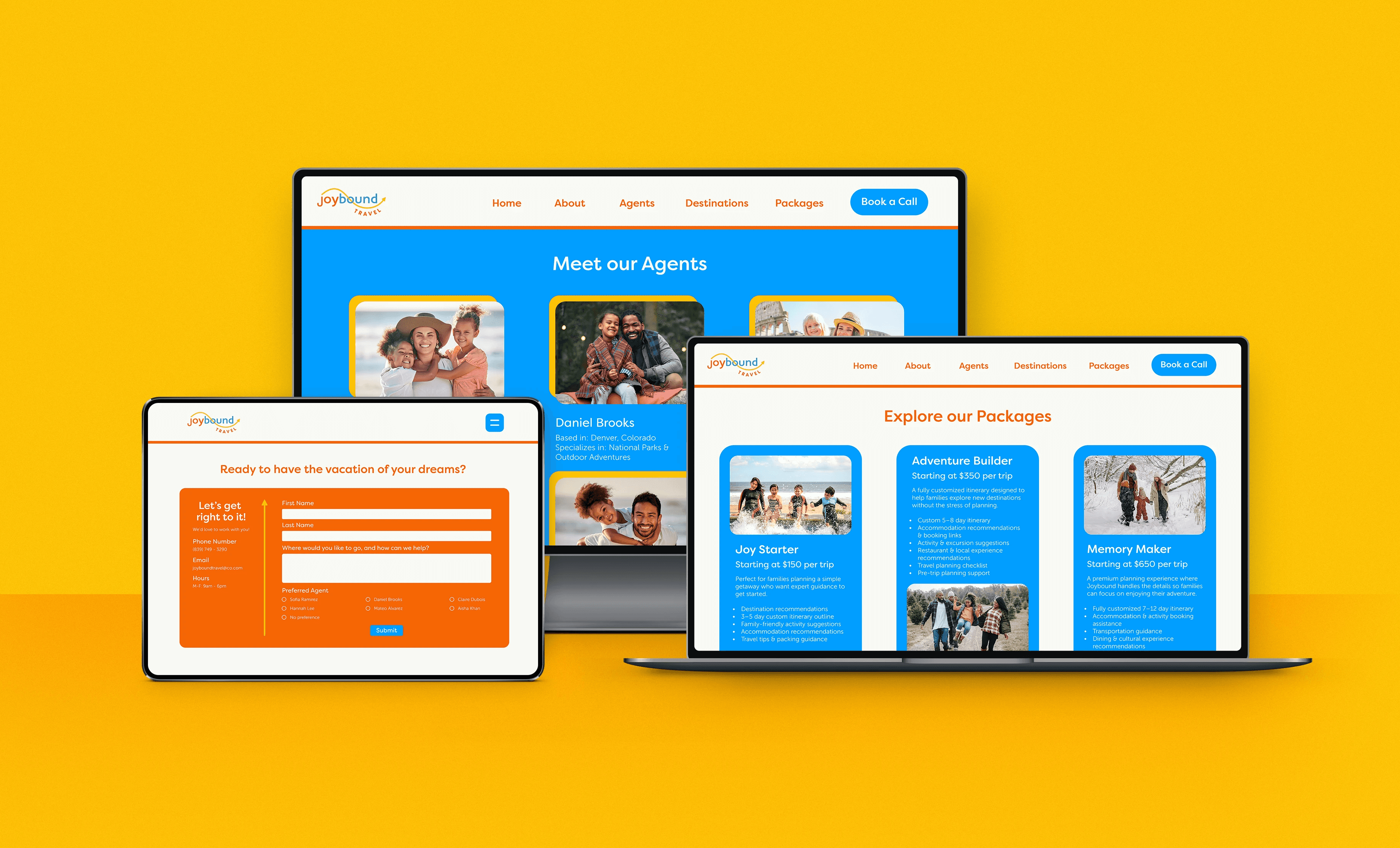
The Joybound website extends the identity into a digital experience designed around the needs of traveling families. Bright color, friendly typography, photography, and clear navigation work together to make exploring destinations and planning a trip feel approachable rather than overwhelming.
Pages for travel packages, agents, and trip inquiries create a consistent experience while helping families move from inspiration to planning. The visual system carries throughout the site, allowing Joybound’s adventurous personality to remain present without sacrificing clarity or usability.
Along for the Ride
Extending the identity beyond the screen.
The visual identity was extended across physical brand touchpoints to show how Joybound could remain recognizable throughout the customer experience. Business cards use the vibrant palette and signature arrow to create an energetic first impression, while branded stationery carries the same sense of movement and optimism into everyday applications.
Together, these touchpoints demonstrate how the Joybound system can flex between digital and print while maintaining a cohesive, welcoming personality.


Related Projects

