Scrunch!
A bold sour popsicle brand that turns every pucker into part of the experience.

Time Frame:
5 Weeks
Category:
Brand Design — Food & Beverage
My Role:
Brand Designer
Turning a sour reaction into a bold brand experience.
Scrunch! is a sour popsicle brand created to bring an extra kick to hot summer days. Made with real fruit and inspired by the unmistakable face you make when something tastes sour, the brand transforms that reaction into a playful and expressive visual identity.
I developed Scrunch! from concept to application, creating a flexible identity system that combines bold typography, energetic color, and expressive graphics. The final brand extends across multiple flavors, packaging, promotional materials, and other touchpoints while maintaining a consistent personality.

Finding the Scrunch
Turning a physical reaction into a visual identity.
The identity began with exploring how the sensation of sourness could be communicated visually. I experimented with irregular letterforms, exaggerated expressions, and playful marks that captured the energy behind the name Scrunch!
These explorations led to an expressive face icon integrated directly into the wordmark. Paired with the stretched and condensed letterforms, the final direction gives the identity a sense of movement and personality while making the sour reaction an instantly recognizable part of the brand.

One Brand, Five Flavors
A flexible identity designed to change with every flavor.
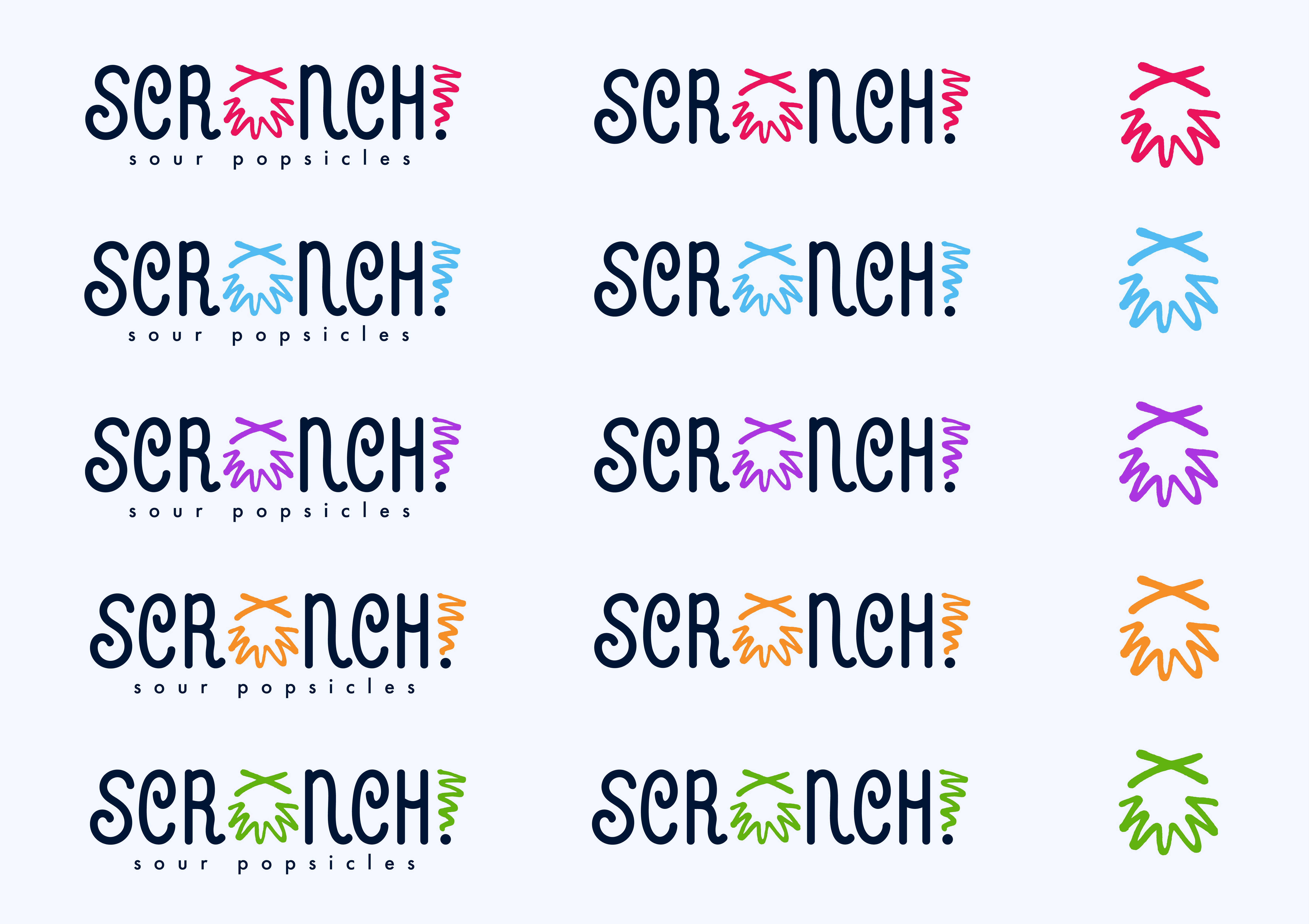
The logo system was designed to stay recognizable while giving each flavor its own personality. Deep Navy anchors the wordmark across the collection, while the expressive icon and exclamation point shift color to represent Cherry, Blue Raspberry, Grape, Tangerine, and Lime.
This creates a flexible system that makes each flavor easy to distinguish without losing the core Scrunch! identity. Primary, secondary, and icon-only marks also allow the brand to adapt across different formats and applications.
Color With a Kick
Bold type and flavor-driven color bring the brand to life.
Scrunch!’s core palette pairs Icy, Cherry, and Deep Navy to create a bold foundation with plenty of contrast. A secondary palette of Blue Raspberry, Tangerine, Lime, and Grape expands the system, allowing color to communicate flavor while keeping the overall identity cohesive.
Futura PT brings boldness and structure to headlines, while Omnes adds a softer, more approachable quality to supporting copy. Together, the typography balances the expressive nature of the identity with the clarity needed across packaging and promotional applications.

Flavor You Can See
Translating the identity into a bold packaging system.
The packaging brings the flavor system directly onto the product, pairing real fruit imagery with bold typography, energetic graphics, and flavor-specific color. Each package follows the same visual structure while changing key elements to reflect the individual popsicle flavor.
This approach creates consistency across the product line while allowing each flavor to stand out on its own. From the front-facing graphics to nutritional information and ingredient messaging, the packaging was designed as a complete extension of the Scrunch! identity.

Beyond the Freezer
Carrying Scrunch!’s energy into every brand interaction.
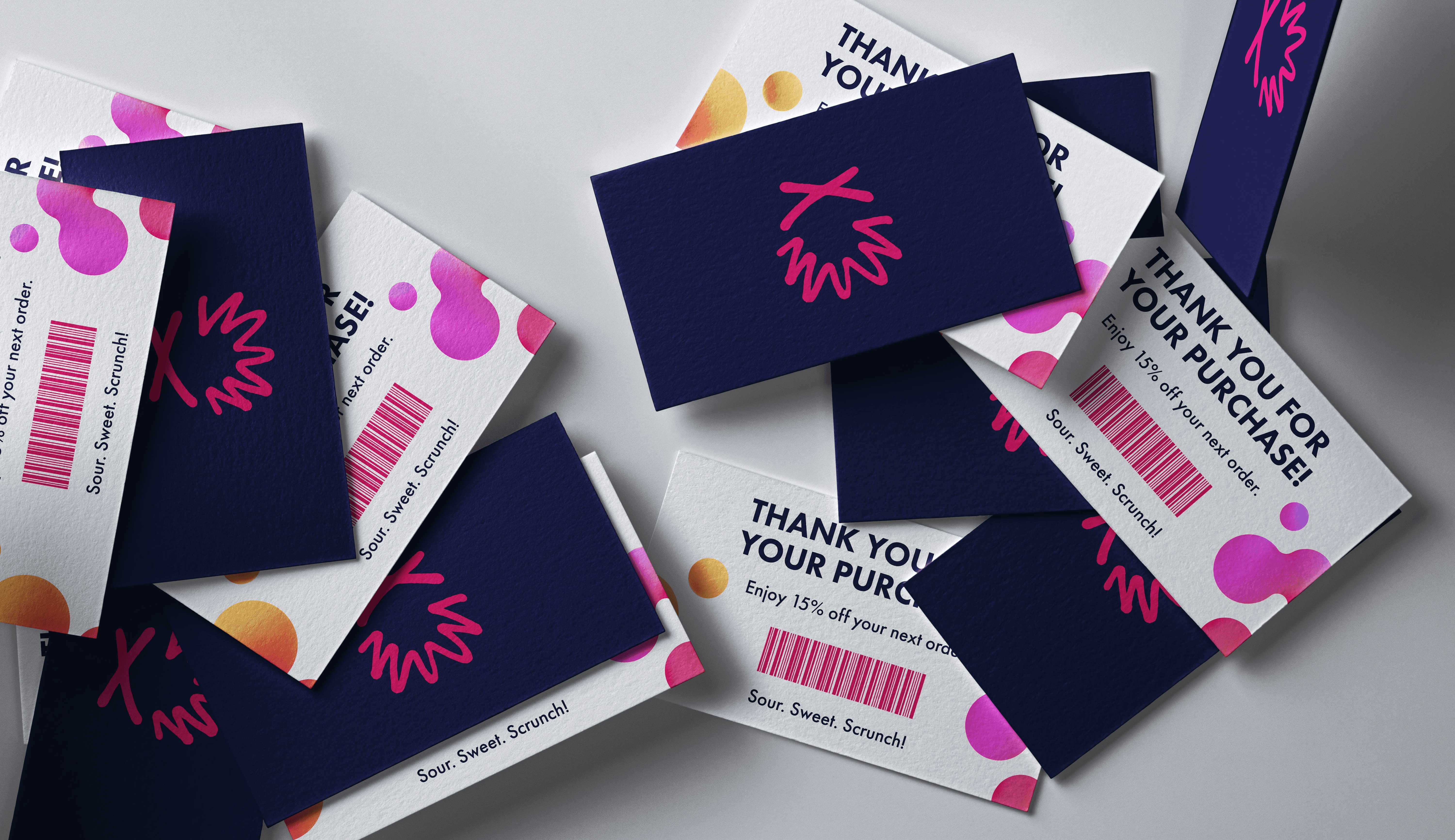
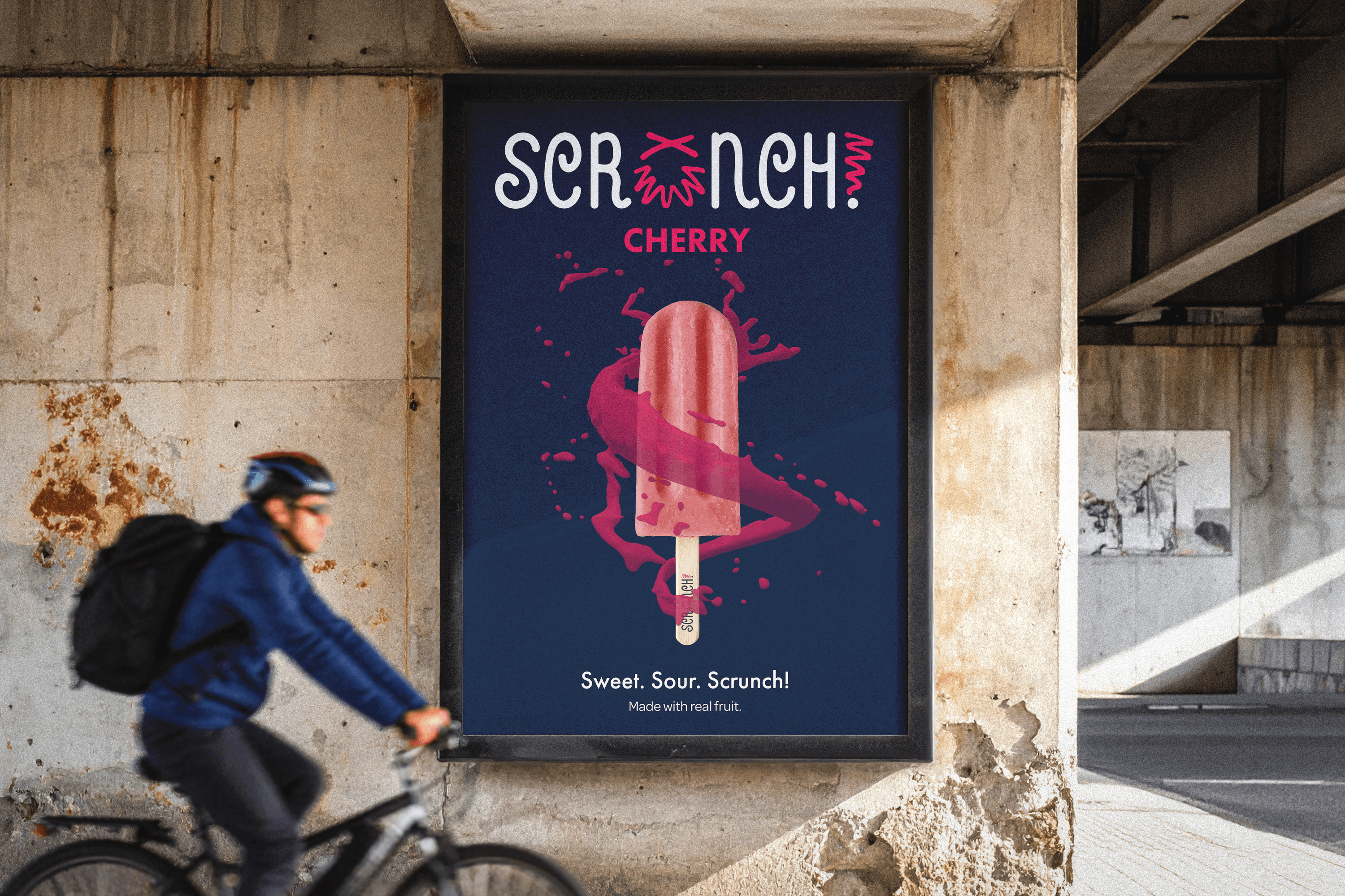
The identity extends beyond packaging into promotional and customer-facing applications that keep the brand playful and recognizable. Thank-you cards use the expressive icon, bold color, and graphic shapes in a smaller format, while advertising brings the popsicle and its sour personality front and center.
Across each application, the visual system remains energetic, colorful, and unmistakably Scrunch!, creating a brand experience that feels just as expressive as the product itself.
Related Projects

